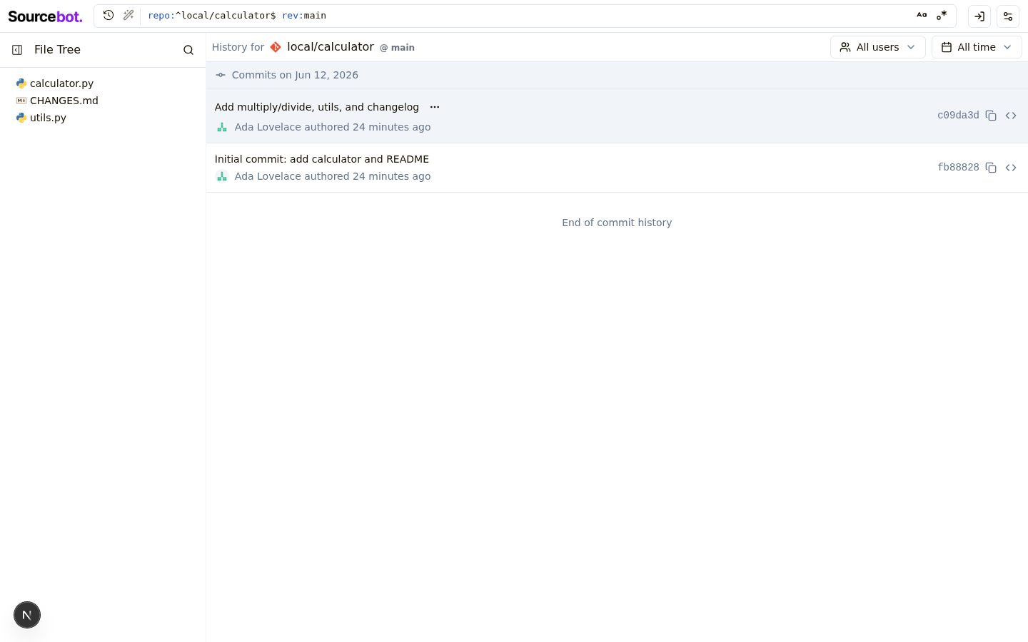
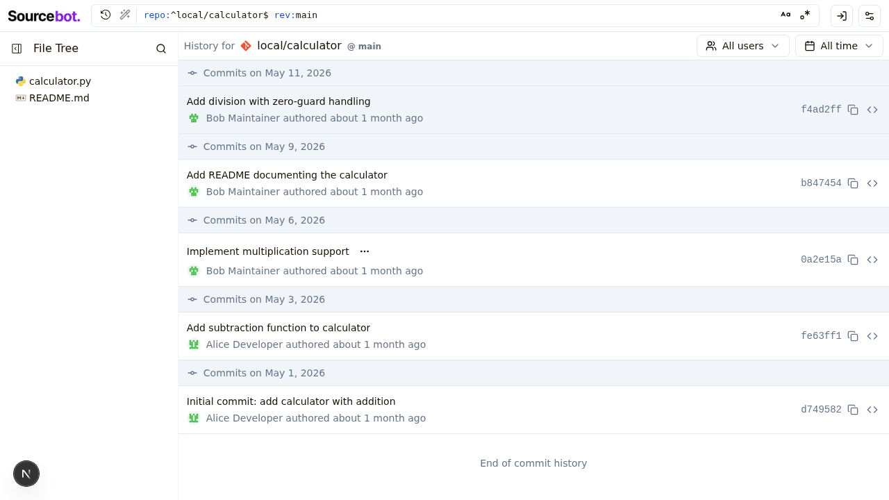
[design-doctor test] sourcebot-1154: Commit diff viewer#2
Conversation
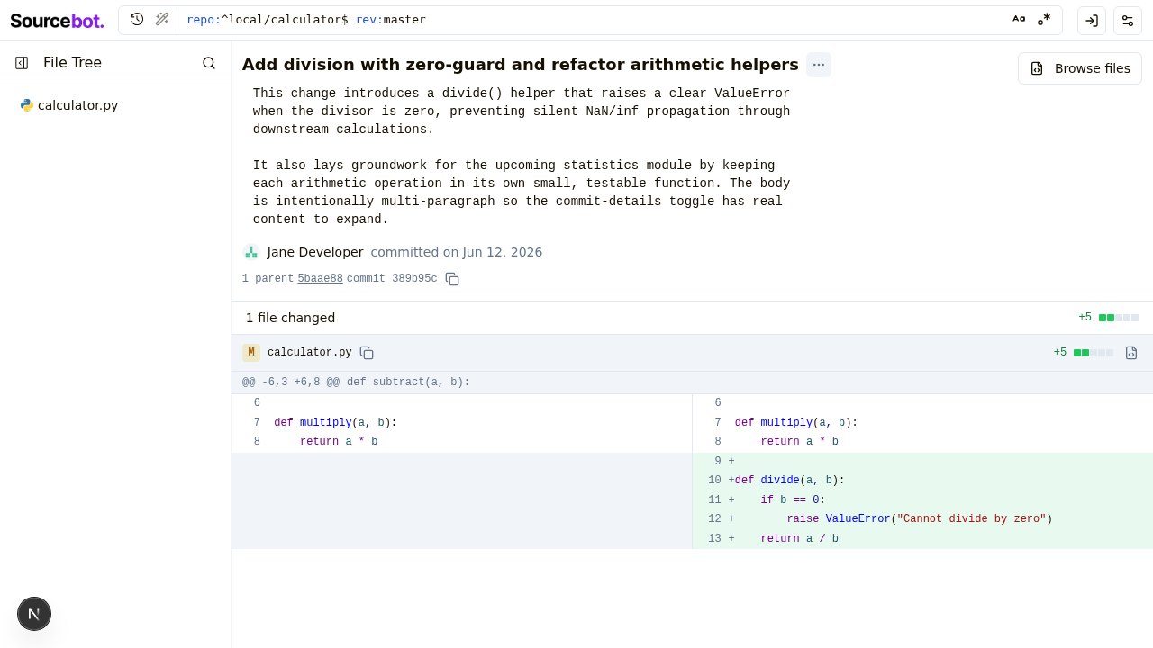
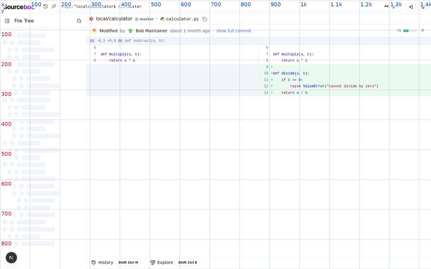
Adds a `commit` pathType to the browse routes
(`/browse/<repo>@<branch>/-/commit/<sha>[/<file>]`) that renders a
placeholder CommitDiffPanel. Refactors browse path helpers into a
discriminated `BrowseProps` union so commitSha is required only for
pathType: 'commit'.

Co-Authored-By: Claude Opus 4.7 (1M context) <noreply@anthropic.com>
Wires up @codemirror/merge (via react-codemirror-merge) inside
CommitDiffPanel with a static before/after demo. Adds a CodeDiff
component that owns its language extension + view ref so each pane
can reconfigure its language compartment independently.

Also gates the react-grab dev scripts behind DEBUG_ENABLE_REACT_GRAP
so they don't load on every dev page render.

Co-Authored-By: Claude Opus 4.7 (1M context) <noreply@anthropic.com>
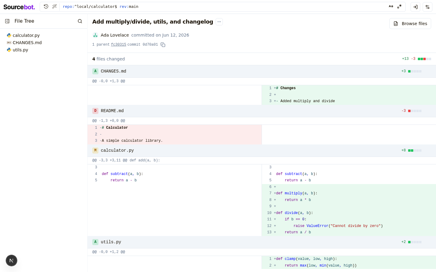
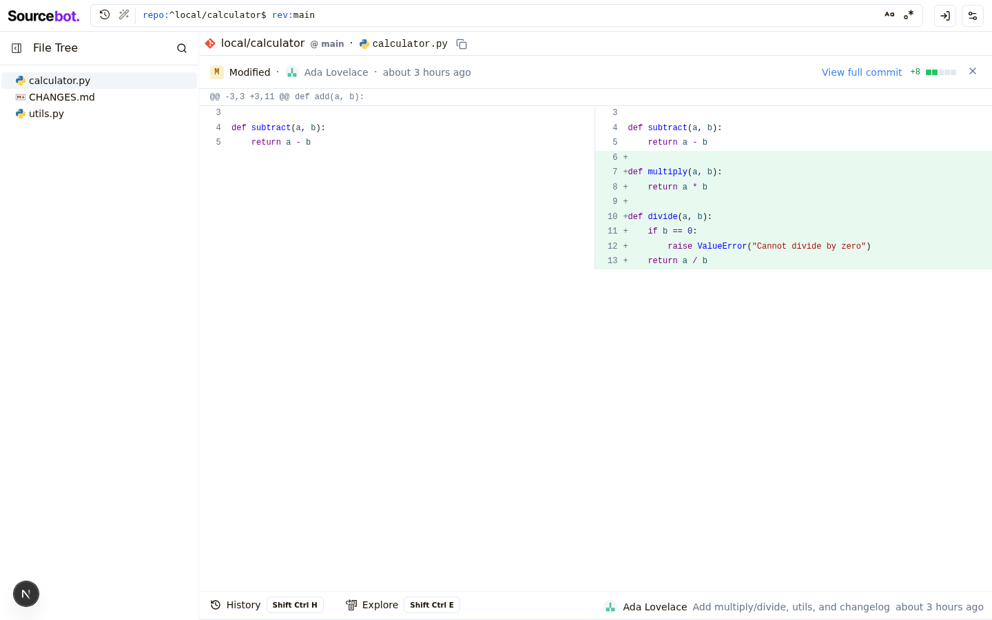
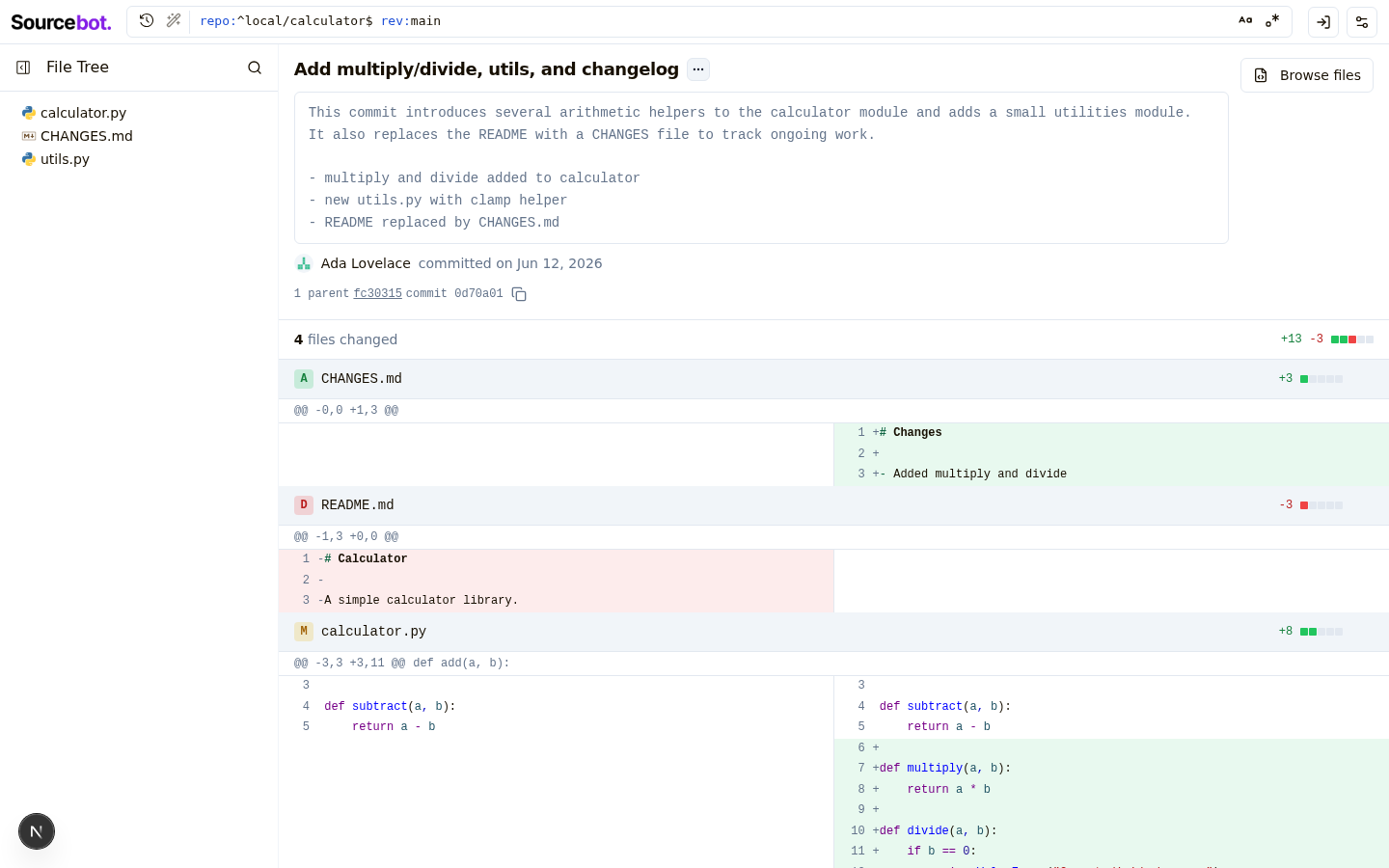
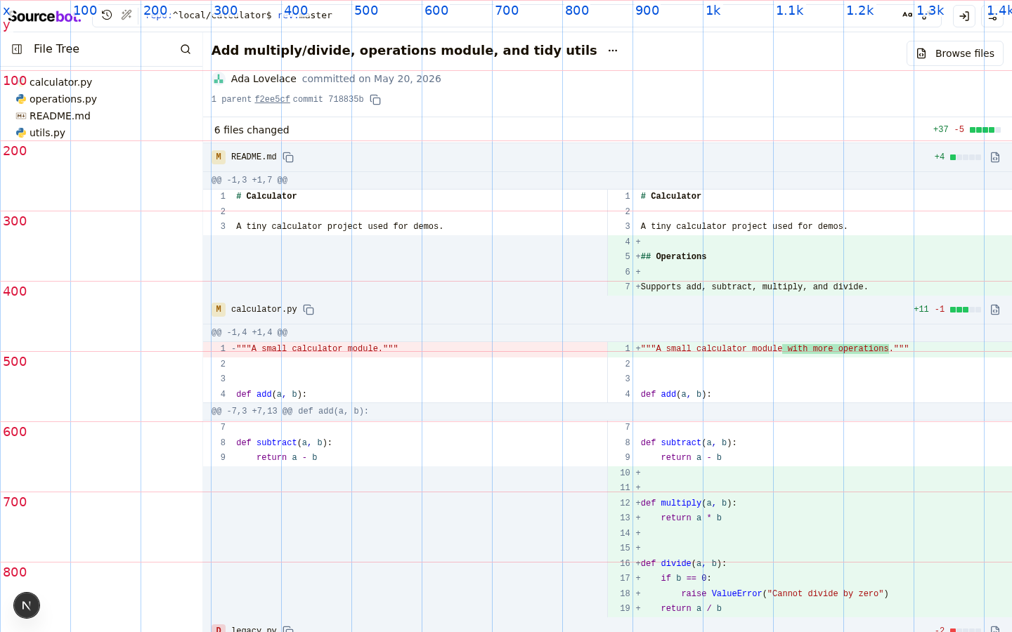
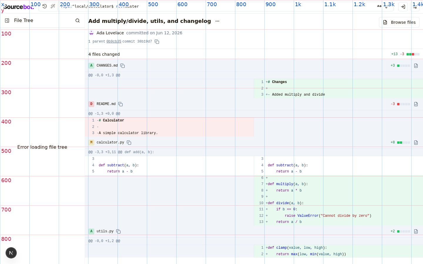
Replace the CodeMirror MergeView-based commit diff rendering with a DOM
based split-view that renders directly from git's hunks, inspired by
Chrome DevTools' DiffView. Per-file editor instances and the matching
getFileSource fetches are gone — a 50-file commit drops from ~100
network requests to 0, and per-row render cost from a full editor mount
to a synchronous Lezer highlight + grid emit.

- New `LightweightDiffViewer` builds a single 2-column subgrid with
  hunk headers spanning both sides; each cell uses `subgrid` so line
  numbers, markers, and content align across all rows.
- Pure helpers split out: `hunkParser` (body string → DiffLine[]),
  `splitPairing` (DiffLine[] → SplitRow[]).
- `presentableDiff` from @codemirror/merge supplies character-level
  intra-line diff highlighting on paired modifications.
- Lezer highlight code lifted from `lightweightCodeHighlighter` into
  `lib/codeHighlight` so both files share the helper.
- Drop `react-codemirror-merge` and `commitDiffEditor`. Long lines wrap
  via `whitespace-pre-wrap break-words` + `minmax(0, 1fr)` on the grid.

Co-Authored-By: Claude Opus 4.7 (1M context) <noreply@anthropic.com>
- File path header now sticks to the top of the scroll viewport while
  scrolling through that file's diff, using the negative-yOffset trick
  to compensate for the virtualizer's translateY positioning. Same
  pattern as searchResultsPanel/fileMatchContainer.
- Lightweight diff viewer's grid uses `minmax(<min>, max-content)` for
  line-number and marker columns so they don't collapse to zero width
  when one side of the diff is entirely blank (fully-added or
  fully-deleted files), keeping the right pane aligned across files.
- Drop the column gap between left and right panes and instead draw a
  `border-r` separator on the left cells for a cleaner divider.
- Hunk header gets an optional className so the first hunk renders with
  just `border-b` (the file header above already provides the top
  border), while subsequent hunks render with `border-y` between them.
- Drop the per-row footer padding in the virtualizer; rows now sit
  flush against each other.

Co-Authored-By: Claude Opus 4.7 (1M context) <noreply@anthropic.com>
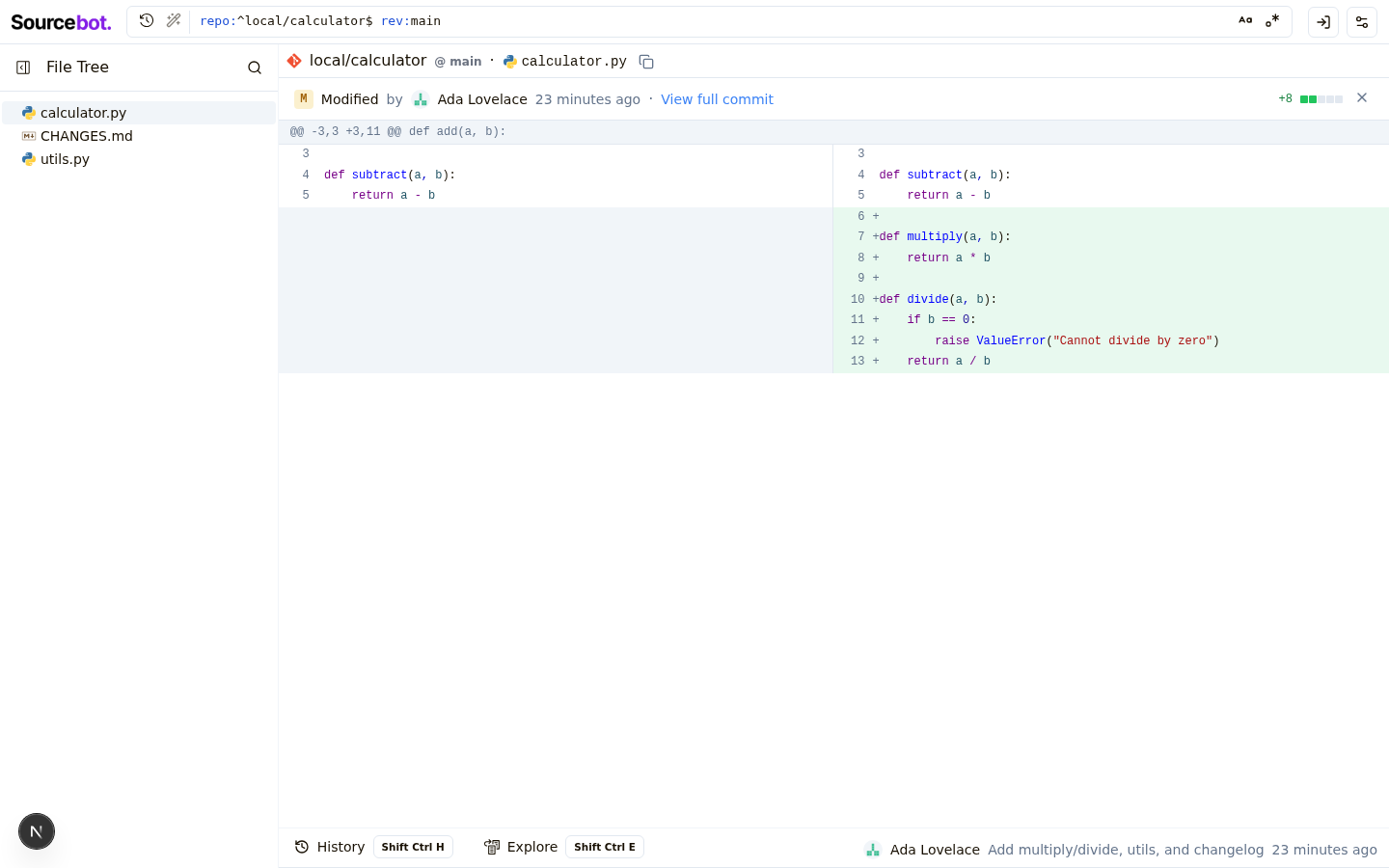
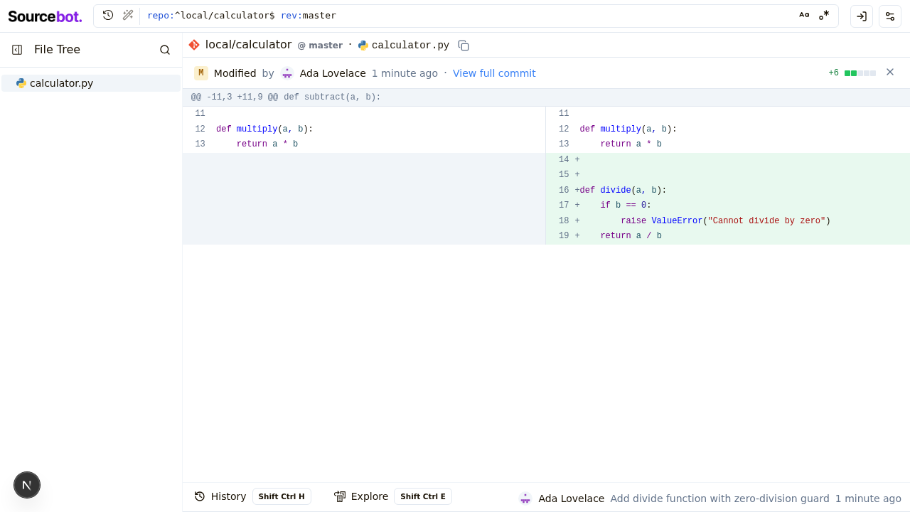
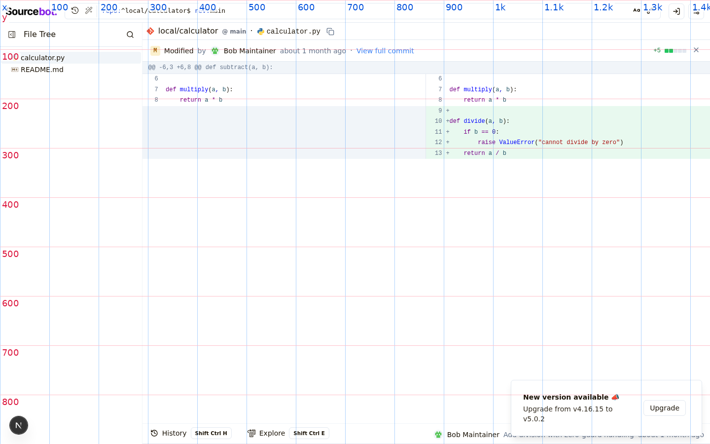
- New `DiffStat` component renders GitHub-style additions/deletions
  counts with a 5-square indicator scaled log-ish to total change size.
  Added on the right of each file row header and on the right of the
  "N files changed" subheader for the commit total. Hidden when there
  are no line-level changes (pure renames).
- Each file row gets a `CopyIconButton` next to the path (copies
  newPath, falling back to oldPath) and a `CommitActionLink` that
  opens the file at the commit. Deleted files link to the old path
  at the parent commit so the user lands on the file's last existing
  state rather than a 404.
- `repoName`, `commitSha`, and `parentSha` are plumbed from the panel
  through `FileDiffList` to `FileDiffRow` to support the new link.
- `computeChangeCounts` is memoized per file in the row.

Co-Authored-By: Claude Opus 4.7 (1M context) <noreply@anthropic.com>
…nchoring
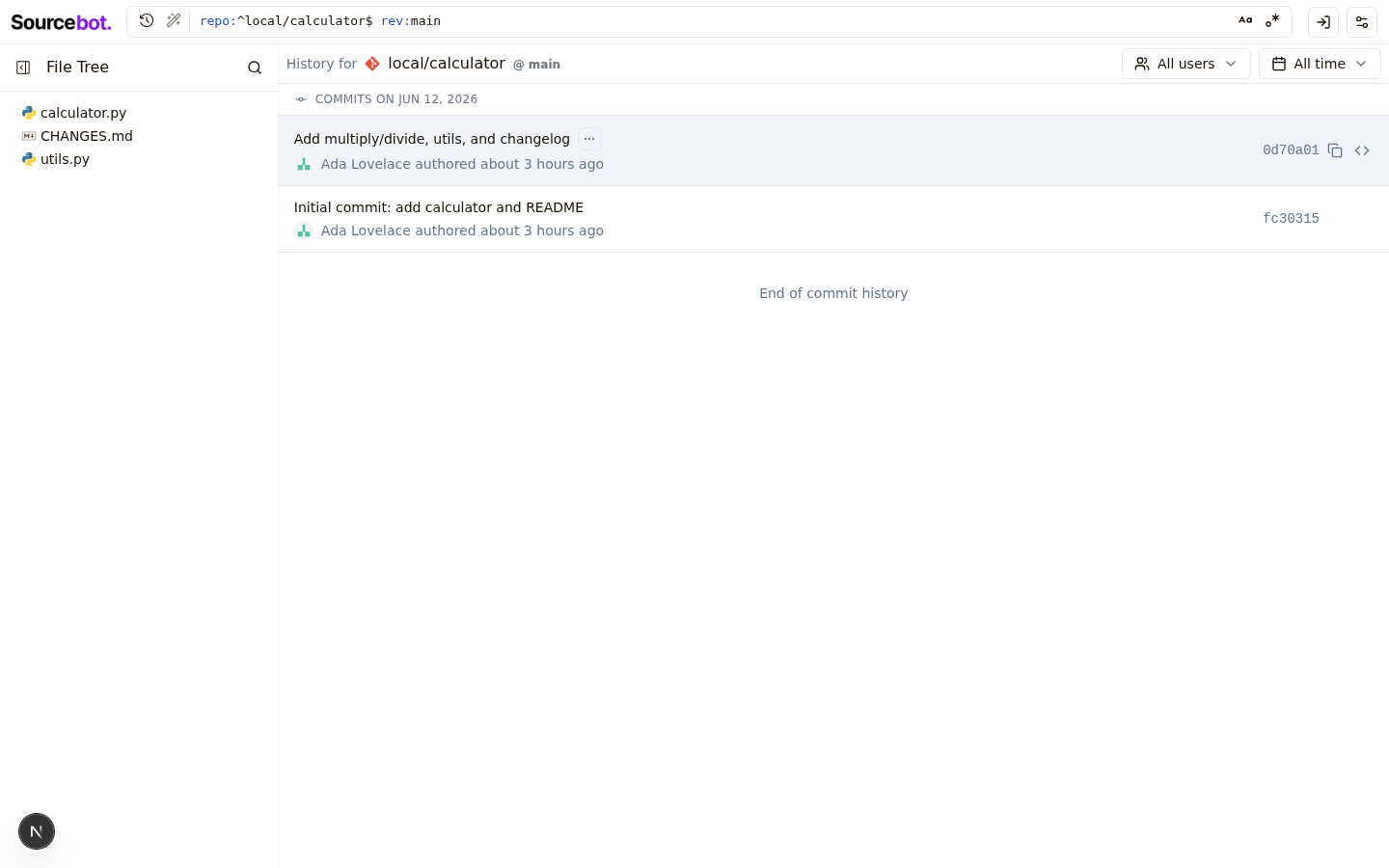
History panel rows in both the bottom panel and the commits page are now
clickable — they navigate to the matching commit diff via router.push,
with closest('button, a') short-circuit so inner action buttons keep
their own behavior. Bottom-panel history rows also highlight via
bg-accent when their commit is the one currently being viewed.
Commit diff header now uses AuthorsAvatarGroup + getCommitAuthors +
formatAuthorsText, matching latestCommitInfo and historyRow — co-authors
parsed from the commit body show up correctly.
When the URL trailing path matches one of the commit's files, that file
is moved to the top of the FileDiffList rather than scrolled to. Avoids
estimateSize-based scroll inaccuracy and works regardless of which side
of a rename the URL points to.
Lightweight diff viewer short-circuits with "Diff too large to display"
for files containing lines over 1000 chars, matching the cutoff in
lightweightCodeHighlighter.
PathHeader's breadcrumb measurement reserved 175px for "copy button and
padding"; the actual reservation needed is ~40px. Reduced so breadcrumbs
no longer collapse prematurely on wide layouts.
Co-Authored-By: Claude Opus 4.7 (1M context) <noreply@anthropic.com>
- Lift `truncateSha` (was a private helper in getDiffToolComponent) to
  `lib/utils` so PathHeader can reuse it. The branch/ref display now
  renders a 40-char SHA as `abc1234`, preserving any `^` / `~N` suffix.
- Hide the `·` separator and the path's CopyIconButton when there's no
  path (repo root). Previously a dangling `·` and copy button rendered
  with nothing between them.

Co-Authored-By: Claude Opus 4.7 (1M context) <noreply@anthropic.com>
Adds a `path` query/tool parameter to restrict diff output to changes
touching a single file via git's `-- <pathspec>` separator. Refactors
the route handler to use the shared `getDiffRequestSchema`.

Fixes SOU-1154 (sourcebot-dev#1154)

Co-Authored-By: Claude Opus 4.7 (1M context) <noreply@anthropic.com>
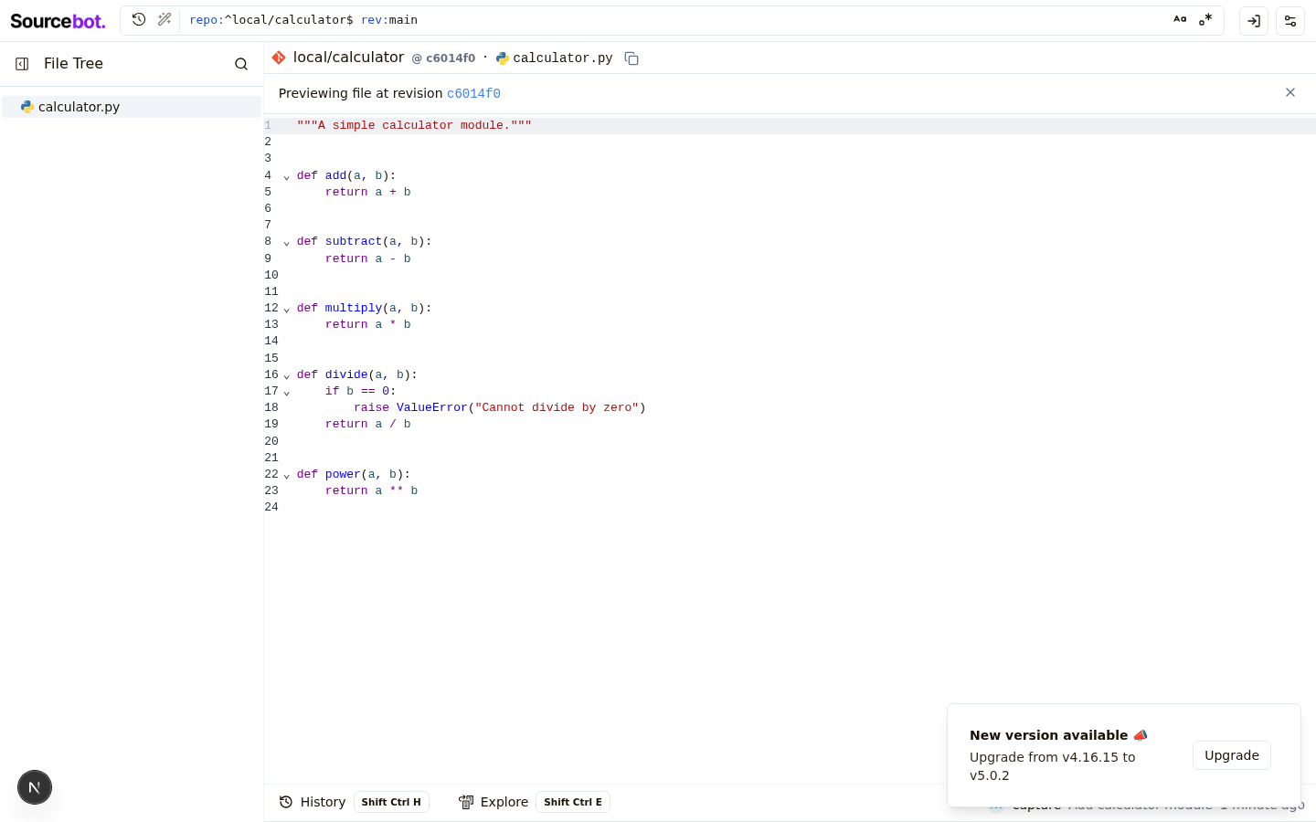
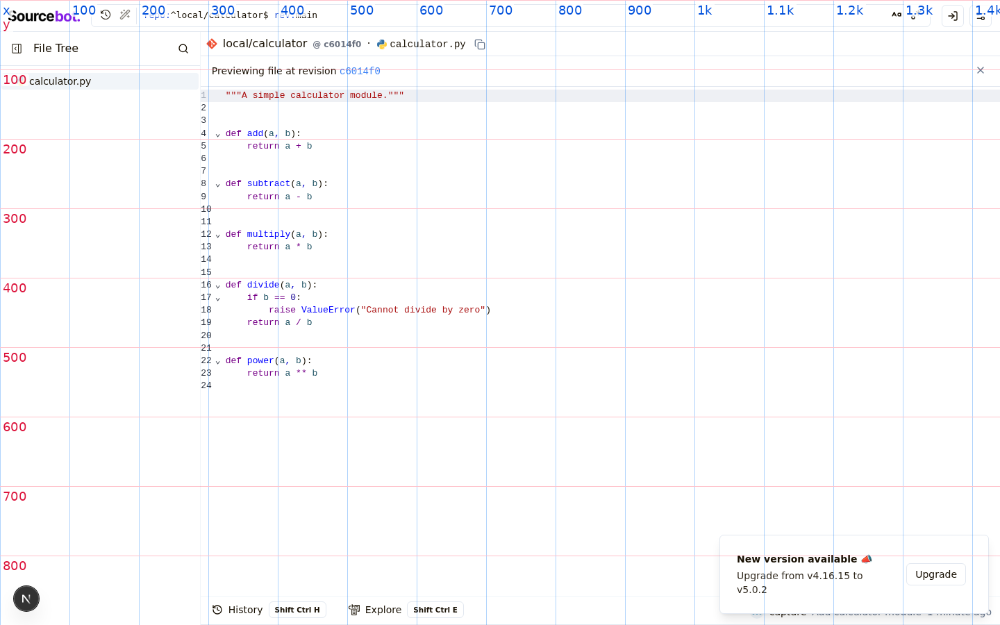
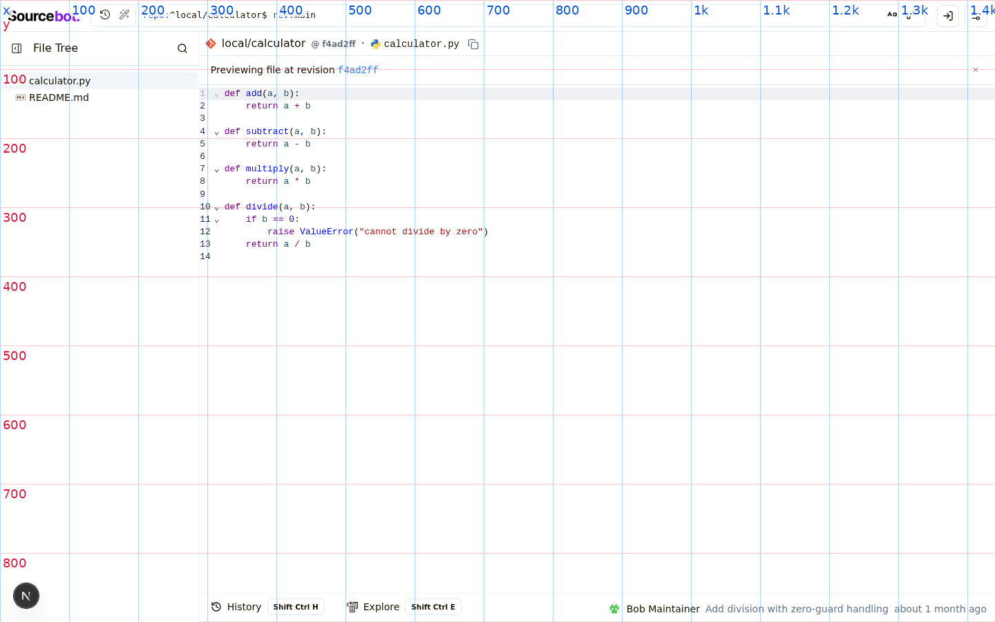
- Move single-file commit diffs from `/-/commit/<sha>/<path>` to
`/-/blob/<path>?ref=<sha>&diff=true`, keeping the user's browsing
revision in the URL. `/-/commit/<sha>` still renders the full
multi-file diff.
- New `FocusedCommitDiffPanel` with status row (file status badge +
authors + relative commit date + "View full commit" + DiffStat +
exit-X) and path-filtered `getDiff` so only the single file's diff
is fetched.
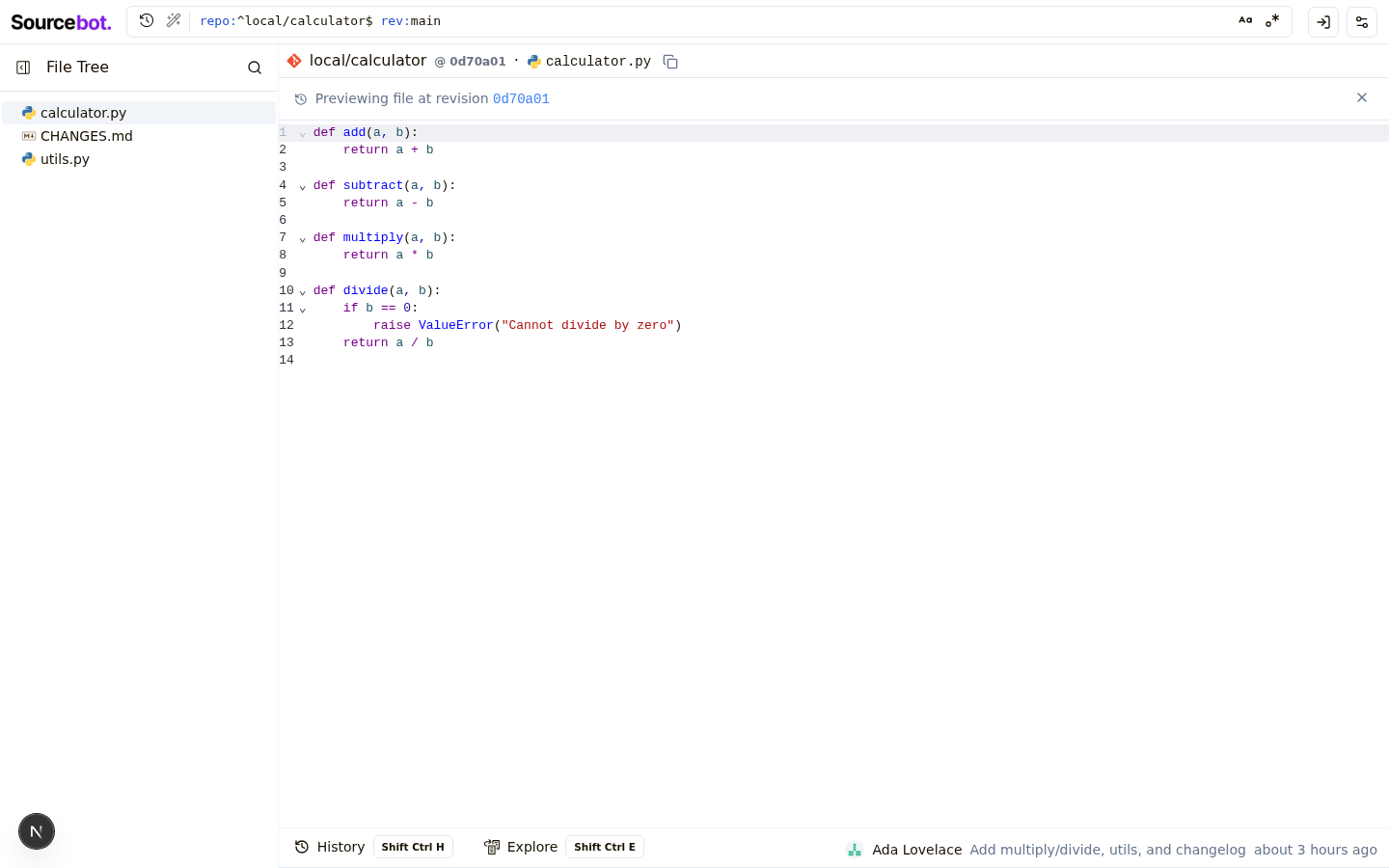
- New preview banner in `CodePreviewPanel` when `?ref=` is set, with a
close button that strips the param.
- Make `PathHeader`'s revision clickable, linking to that ref's full
commit view.
- New `HoverPrefetchLink` defers Next.js prefetching until hover; used
in history rows to avoid firing many prefetches on render.
- Hide the bottom panel on `/-/commit/` views.
- Extract `getFileStatus` / `StatusBadge` to a shared `fileStatus.tsx`.
- Workaround Radix Tooltip + RSC re-render bug (drop `asChild` from
`<TooltipTrigger>`, add `key={commitSha}`) so X / Browse-files
buttons survive client navigation between commits.
Co-Authored-By: Claude Opus 4.7 (1M context) <noreply@anthropic.com>
| })} | ||
| aria-label="Exit diff view" | ||
| > | ||
| <X className="h-4 w-4" /> |
This comment was marked as outdated.
This comment was marked as outdated.
Sorry, something went wrong.
| })} | ||
| aria-label="Close preview" | ||
| > | ||
| <X className="h-4 w-4" /> |
This comment was marked as outdated.
This comment was marked as outdated.
Sorry, something went wrong.
| <span className="text-sm text-muted-foreground">by</span> | ||
| <AuthorsAvatarGroup authors={authors} /> | ||
| <span | ||
| className="text-sm font-medium" |
This comment was marked as outdated.
This comment was marked as outdated.
Sorry, something went wrong.
| parents={commitResponse.parents} | ||
| /> | ||
| </div> | ||
| <div className="flex flex-row items-center justify-between gap-2 px-4 py-2 border-b shrink-0"> |
This comment was marked as outdated.
This comment was marked as outdated.
Sorry, something went wrong.
RedesignFull commit page
Focused diff
Preview banner
Commit description
Commit history
Prompt to build with AIDeveloper outputReal app context
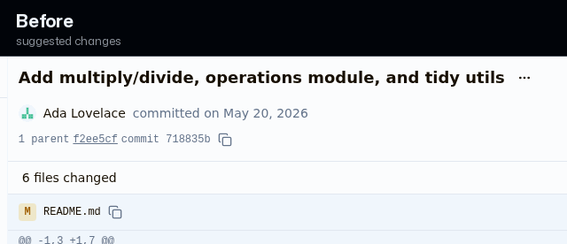
Prototype detailsCalm, aligned commit diff viewerMatched before/after Full commit diff pageFocused single-file commit diffFile preview-at-revision bannerFull commit diff — commit body expandedCommit history list — clickable rows
Status: Changed files
Prototype diff excerptdiff --git a/packages/shared/src/entitlements.ts b/packages/shared/src/entitlements.ts
index de841a0d..b7ab5ad9 100644
--- a/packages/shared/src/entitlements.ts
+++ b/packages/shared/src/entitlements.ts
@@ -131,8 +131,7 @@ const licenseKey = getLicenseKey();
}
export const hasEntitlement = (entitlement: Entitlement) => {
- const entitlements = getEntitlements();
- return entitlements.includes(entitlement);
+ return true;
}
export const getEntitlements = (): Entitlement[] => {
diff --git a/packages/web/next.config.mjs b/packages/web/next.config.mjs
index 6211fcfe..027b4994 100644
--- a/packages/web/next.config.mjs
+++ b/packages/web/next.config.mjs
@@ -5,6 +5,8 @@ import { withSentryConfig } from "@sentry/nextjs";
const nextConfig = {
output: "standalone",
+ allowedDevOrigins: ["127.0.0.1", "localhost"],
+
// This is required when using standalone builds.
// @see: https://env.t3.gg/docs/nextjs#create-your-schema
transpilePackages: ["@t3-oss/env-core"],
diff --git a/packages/web/src/app/(app)/browse/[...path]/components/codePreviewPanel/codePreviewPanel.tsx b/packages/web/src/app/(app)/browse/[...path]/components/codePreviewPanel/codePreviewPanel.tsx
index bad7e67c..47bb9dfd 100644
--- a/packages/web/src/app/(app)/browse/[...path]/components/codePreviewPanel/codePreviewPanel.tsx
+++ b/packages/web/src/app/(app)/browse/[...path]/components/codePreviewPanel/codePreviewPanel.tsx
@@ -4,7 +4,7 @@ import { Button } from "@/components/ui/button";
import { Separator } from "@/components/ui/separator";
import { Tooltip, TooltipContent, TooltipTrigger } from "@/components/ui/tooltip";
import { cn, getCodeHostInfoForRepo, isServiceError, truncateSha } from "@/lib/utils";
-import { X } from "lucide-react";
+import { History, X } from "lucide-react";
import Image from "next/image";
import Link from "next/link";
import { getBrowsePath } from "../../../hooks/utils";
@@ -85,29 +85,32 @@ export const CodePreviewPanel = async ({ path, repoName, revisionName, previewRe
</div>
<Separator />
{previewRef && (
- <div className="flex flex-row items-center justify-between gap-2 px-4 py-2 border-b shrink-0">
- <span className="text-sm">
- Previewing file at revision{" "}
- <Link
- href={getBrowsePath({
- repoName,
- revisionName,
- path: '',
- pathType: 'commit',
- commitSha: previewRef,
- })}
- className="font-mono text-link hover:underline"
- >
- {truncateSha(previewRef)}
- </Link>
- </span>
+ <div className="flex flex-row items-center justify-between gap-2 px-4 py-2 border-b shrink-0 bg-muted/50">
+ <div className="flex flex-row items-center gap-2 min-w-0">
+ <History className="h-3.5 w-3.5 text-muted-foreground flex-shrink-0" />
+ <span className="text-sm text-muted-foreground truncate">
+ Previewing file at revision{" "}
+ <Link
+ href={getBrowsePath({
+ repoName,
+ revisionName,
+ path: '',
+ pathType: 'commit',
+ commitSha: previewRef,
+ })}
+ className="font-mono text-link hover:underline"
+ >
+ {truncateSha(previewRef)}
+ </Link>
+ </span>
+ </div>
<Tooltip key={previewRef}>
<TooltipTrigger>
<Button
asChild
variant="ghost"
size="icon"
- className="h-6 w-6 text-muted-foreground"
+ className="h-6 w-6 text-muted-foreground flex-shrink-0"
>
<Link
href={getBrowsePath({
@@ -118,7 +121,7 @@ export const CodePreviewPanel = async ({ path, repoName, revisionName, previewRe
})}
aria-label="Close preview"
>
- <X className="h-4 w-4" />
+ <X className="h-3.5 w-3.5" />
</Link>
</Button>
</TooltipTrigger>
diff --git a/packages/web/src/app/(app)/browse/[...path]/components/commitDiffPanel/commitMessage.tsx b/packages/web/src/app/(app)/browse/[...path]/components/commitDiffPanel/commitMessage.tsx
index 7d9a27d4..5ddbe46a 100644
--- a/packages/web/src/app/(app)/browse/[...path]/components/commitDiffPanel/commitMessage.tsx
+++ b/packages/web/src/app/(app)/browse/[...path]/components/commitDiffPanel/commitMessage.tsx
@@ -15,7 +15,7 @@ export const CommitMessage = ({ subject, body }: CommitMessageProps) => {
return (
<>
<div className="flex flex-row items-center gap-2">
- <h1 className="text-lg font-semibold">{subject}</h1>
+ <h1 className="text-lg font-semibold leading-snug tracking-tight">{subject}</h1>
{hasBody && (
<CommitBodyToggle
pressed={isBodyExpanded}
@@ -24,7 +24,10 @@ export const CommitMessage = ({ subject, body }: CommitMessageProps) => {
)}
</div>
{hasBody && isBodyExpanded && (
- <CommitBody body={body} className="rounded max-h-[40vh] overflow-y-auto" />
+ <CommitBody
+ body={body}
+ className="mt-2.5 rounded-md border max-h-[40vh] overflow-y-auto"
+ />
)}
</>
);
diff --git a/packages/web/src/app/(app)/browse/[...path]/components/commitDiffPanel/fileDiffRow.tsx b/packages/web/src/app/(app)/browse/[...path]/components/commitDiffPanel/fileDiffRow.tsx
index d7c5c50e..2e97438f 100644
--- a/packages/web/src/app/(app)/browse/[...path]/components/commitDiffPanel/fileDiffRow.tsx
+++ b/packages/web/src/app/(app)/browse/[...path]/components/commitDiffPanel/fileDiffRow.tsx
@@ -58,13 +58,16 @@ export const FileDiffRow = ({ file, yOffset, repoName, commitSha, parentSha }: F
return (
<div className="flex flex-col">
<div
- className="flex flex-row items-center gap-2 py-2 px-3 border-b bg-muted sticky z-10"
+ className="group flex flex-row items-center gap-2 py-2 px-4 border-b bg-muted sticky z-10"
style={{ top: `-${yOffset}px` }}
>
<StatusBadge status={status} />
<div className="flex-1 min-w-0 flex flex-row items-center gap-1 overflow-hidden">
- <code className="text-xs truncate">{getDisplayPath(file)}</code>
- <CopyIconButton onCopy={onCopyPath} className="flex-shrink-0" />
+ <code className="text-sm truncate">{getDisplayPath(file)}</code>
+ <CopyIconButton
+ onCopy={onCopyPath}
+ className="flex-shrink-0 opacity-0 group-hover:opacity-100 focus-visible:opacity-100 transition-opacity"
+ />
</div>
<DiffStat {...changeCounts} />
{viewAtCommitHref && (
@@ -72,6 +75,7 @@ export const FileDiffRow = ({ file, yOffset, repoName, commitSha, parentSha }: F
href={viewAtCommitHref}
label="View code at this commit"
icon={<FileCode className="h-3 w-3" />}
+ className="opacity-0 group-hover:opacity-100 focus-visible:opacity-100 transition-opacity"
/>
)}
</div>
diff --git a/packages/web/src/app/(app)/browse/[...path]/components/commitDiffPanel/focusedCommitDiffPanel.tsx b/packages/web/src/app/(app)/browse/[...path]/components/commitDiffPanel/focusedCommitDiffPanel.tsx
index 308ab9f6..2b02b96b 100644
--- a/packages/web/src/app/(app)/browse/[...path]/components/commitDiffPanel/focusedCommitDiffPanel.tsx
+++ b/packages/web/src/app/(app)/browse/[...path]/components/commitDiffPanel/focusedCommitDiffPanel.tsx
@@ -116,27 +116,29 @@ export const FocusedCommitDiffPanel = async ({
</div>
{file ? (
<>
- <div className="flex flex-row items-center justify-between gap-2 px-4 py-2 border-b shrink-0">
- <div className="flex flex-row items-center gap-2">
+ <div className="flex flex-row items-center justify-between gap-3 px-4 py-2.5 border-b shrink-0">
+ <div className="flex flex-row items-center gap-2 min-w-0">
<StatusBadge status={getFileStatus(file)} />
- <h2 className="text-sm font-medium">
+ <h2 className="text-sm font-medium flex-shrink-0">
{FILE_STATUS_LABELS[getFileStatus(file)]}
</h2>
- <span className="text-sm text-muted-foreground">by</span>
+ <span className="text-muted-foreground flex-shrink-0">·</span>
<AuthorsAvatarGroup authors={authors} />
<span
- className="text-sm font-medium"
+ className="text-sm text-muted-foreground truncate"
title={authors.map((a) => a.name).join(", ")}
>
{formatAuthorsText(authors)}
</span>
+ <span className="text-muted-foreground flex-shrink-0">·</span>
<span
- className="text-sm text-muted-foreground"
+ className="text-sm text-muted-foreground flex-shrink-0 whitespace-nowrap"
title={absoluteDate}
>
{relativeDate}
</span>
- <span className="text-muted-foreground">·</span>
+ </div>
+ <div className="flex flex-row items-center gap-3 flex-shrink-0">
<Link
href={getBrowsePath({
repoName,
@@ -145,12 +147,10 @@ export const FocusedCommitDiffPanel = async ({
pathType: 'commit',
commitSha,
})}
- className="text-sm text-link hover:underline"
+ className="text-sm text-link hover:underline whitespace-nowrap"
>
View full commit
</Link>
- </div>
- <div className="flex flex-row items-center gap-2">
<DiffStat {...computeChangeCounts(file)} />
<Tooltip key={commitSha}>
Remaining issues
CostClaude Code reported cost: $63.0732 Claude Code session costs and timings
|

| parents={commitResponse.parents} | ||
| /> | ||
| </div> | ||
| <div className="flex flex-row items-center justify-between gap-2 px-4 py-2 border-b shrink-0"> |
There was a problem hiding this comment.
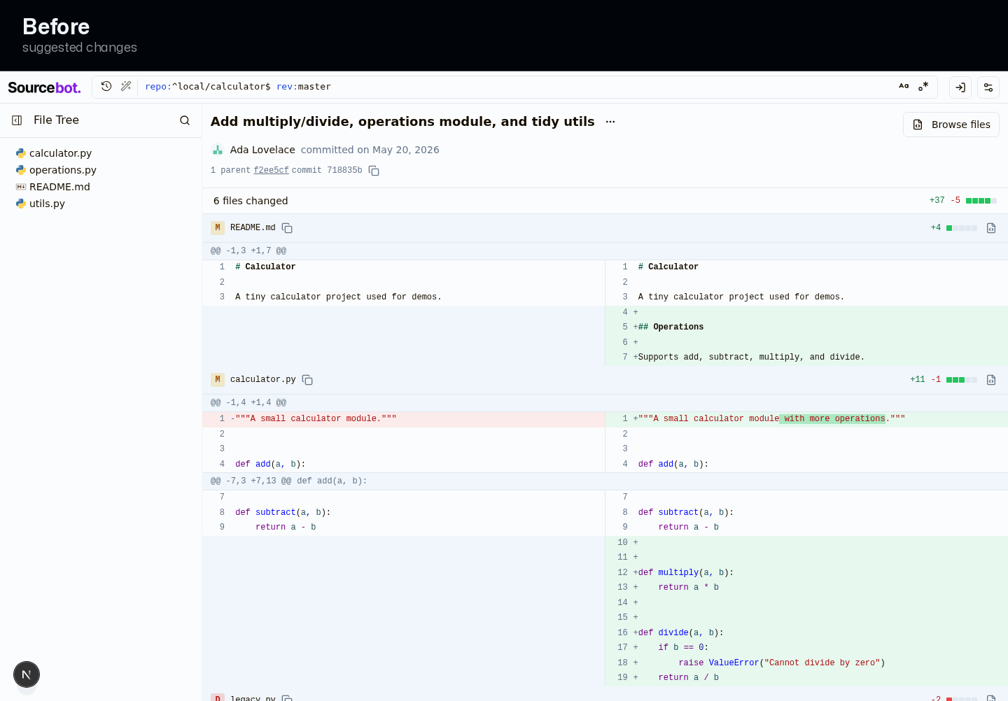
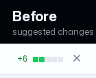
Change summary doesn't line up with the rest of the commit page
On the commit page, the 'files changed' summary sits slightly further in from the left than the commit details above it and the file list below it. That small step makes the page feel less tidy and harder to scan as one clean column.
Prompt to fix with AI
This is a comment left during a design review.

Comment:
**Change summary doesn't line up with the rest of the commit page**
On the commit page, the 'files changed' summary sits slightly further in from the left than the commit details above it and the file list below it. That small step makes the page feel less tidy and harder to scan as one clean column.

Issue:
The summary bar wraps '<N> files changed' + DiffStat in a div with px-4 py-2 (fullCommitDiffPanel.tsx:113), so its content starts 16px from the panel edge.

Suggested fix:
Change the summary bar's px-4 to px-3 (or p-3 equivalent) so its content aligns with the commit header and file row left edge.

Screenshots:
- Before: https://drive.orianna.ai/508965ade6ff563a5472ae3764c20d75.png
- After: https://drive.orianna.ai/e76370f5939d23e98f6a138e009cc304.png
Use these screenshot URLs as visual evidence if your environment can open remote images.

How can I resolve this? Keep the fix scoped to the PR-touched UI and preserve existing design-system patterns.
| })} | ||
| aria-label="Exit diff view" | ||
| > | ||
| <X className="h-4 w-4" /> |
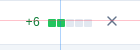
There was a problem hiding this comment.
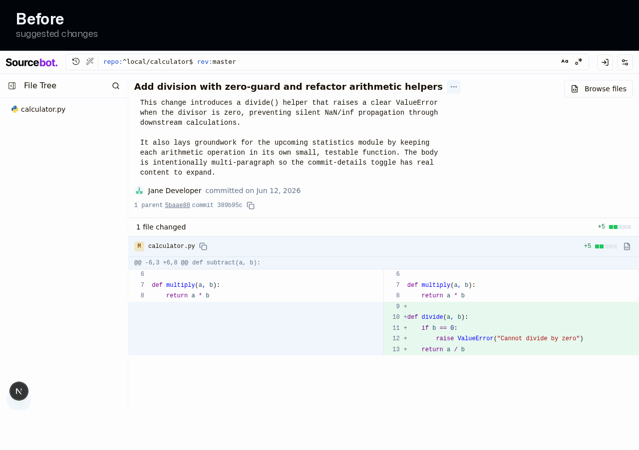
Close control in the diff header feels slightly off from the other small controls
The control that exits the single-file diff uses a slightly larger glyph than the other small icon controls in this area, so the header feels a touch less consistent. Matching it to the same small-icon treatment makes the header read as one tidy set of controls.
Prompt to fix with AI
This is a comment left during a design review.

Comment:
**Close control in the diff header feels slightly off from the other small controls**
The control that exits the single-file diff uses a slightly larger glyph than the other small icon controls in this area, so the header feels a touch less consistent. Matching it to the same small-icon treatment makes the header read as one tidy set of controls.

Issue:
focusedCommitDiffPanel.tsx:157-173 hand-rolls a ghost Button size="icon" h-6 w-6 with an <X className="h-4 w-4" /> glyph, rather than reusing the shared small icon-button wrappers.

Suggested fix:
Render the close glyph at h-3 w-3 to match the area convention (ideally via the shared icon-button wrapper) so the header's controls are uniform.

Screenshots:
- Before: https://drive.orianna.ai/9ef5892b4f0081bbc673c83981229948.png
- After: https://drive.orianna.ai/9f3e81a6d773c3ed7227324625b3f8e4.png
Use these screenshot URLs as visual evidence if your environment can open remote images.

How can I resolve this? Keep the fix scoped to the PR-touched UI and preserve existing design-system patterns.
| })} | ||
| aria-label="Close preview" | ||
| > | ||
| <X className="h-4 w-4" /> |
There was a problem hiding this comment.

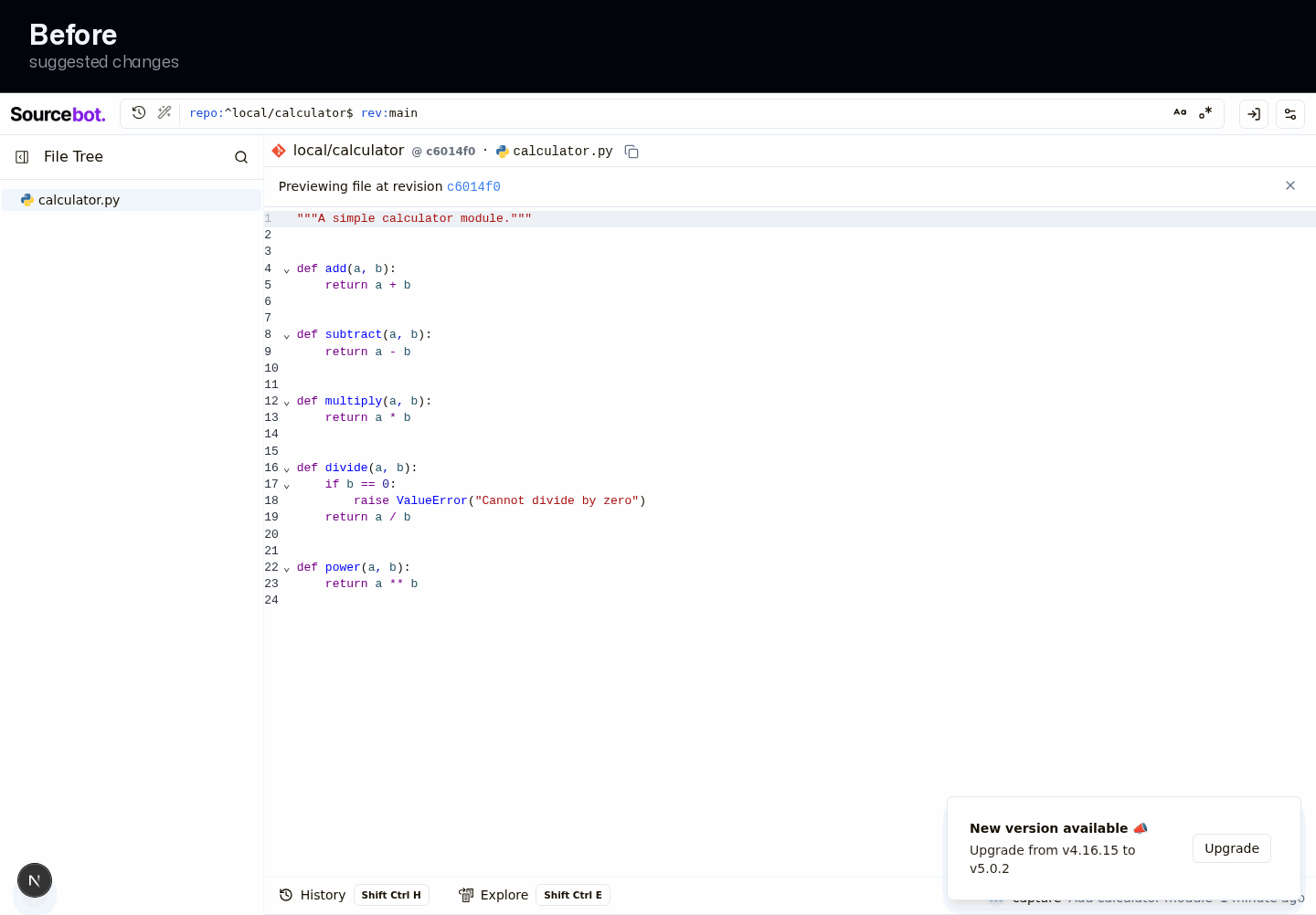
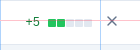
Preview banner's close control is sized differently from nearby small icons
The control that dismisses the 'previewing an older revision' banner uses a slightly larger glyph than the other small icon controls around it. Matching the standard small-icon size keeps the banner feeling consistent with the rest of the browser.
Prompt to fix with AI
This is a comment left during a design review.

Comment:
**Preview banner's close control is sized differently from nearby small icons**
The control that dismisses the 'previewing an older revision' banner uses a slightly larger glyph than the other small icon controls around it. Matching the standard small-icon size keeps the banner feeling consistent with the rest of the browser.

Issue:
codePreviewPanel.tsx:106-122 hand-rolls a ghost Button size="icon" h-6 w-6 with an <X className="h-4 w-4" /> glyph.

Suggested fix:
Render the banner close glyph at h-3 w-3 (ideally via the shared icon-button wrapper) so it matches the surrounding small controls.

Screenshots:
- Before: https://drive.orianna.ai/f3a9942e8d1e3c60999eae29a091097b.png
- After: https://drive.orianna.ai/f9a0f7e4e1391fc6c0c46d6491c89366.png
Use these screenshot URLs as visual evidence if your environment can open remote images.

How can I resolve this? Keep the fix scoped to the PR-touched UI and preserve existing design-system patterns.

| </div> | ||
| {file ? ( | ||
| <> | ||
| <div className="flex flex-row items-center justify-between gap-2 px-4 py-2 border-b shrink-0"> |
There was a problem hiding this comment.

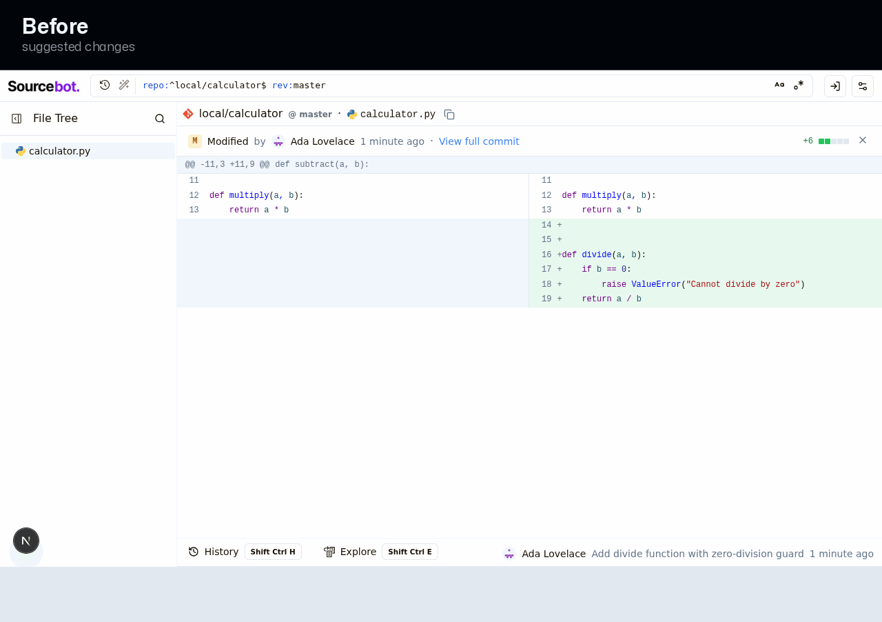
Diff header can get crowded when the author or date is longer
In the single-file diff, the author name, date, and 'view full commit' link sit in one row with the change summary and close control. When the author name or date is longer, that text can push against the summary and the close control, making the header feel cramped and the close control harder to reach.
Prompt to fix with AI
This is a comment left during a design review.

Comment:
**Diff header can get crowded when the author or date is longer**
In the single-file diff, the author name, date, and 'view full commit' link sit in one row with the change summary and close control. When the author name or date is longer, that text can push against the summary and the close control, making the header feel cramped and the close control harder to reach.

Issue:
focusedCommitDiffPanel.tsx:119-178: the left metadata group is 'flex flex-row items-center gap-2' with no min-w-0 and no truncation on the author/date spans; the right group holding DiffStat + close has no flex-shrink-0 guard on its container.

Suggested fix:
Give the left metadata group min-w-0 and truncate the author/date text, and mark the trailing diffstat+close group flex-shrink-0, mirroring the full commit header's overflow protection.

Screenshots:
- Before: https://drive.orianna.ai/29dac6001586f95cc5db5b976c7210bf.png
- After: https://drive.orianna.ai/b28bcba62d12c747b7e35ecc8375dcd7.png
Use these screenshot URLs as visual evidence if your environment can open remote images.

How can I resolve this? Keep the fix scoped to the PR-touched UI and preserve existing design-system patterns.


Softlight Overview
Design Score: 1/5
Suggested fixes
Redesign
The commit diff screens felt cramped and slightly unfinished, with mismatched edges and busy metadata; the pass lined everything up to one column, calmed the details, and made the special states read clearly.
Fresh clean test PR for hosted Design Doctor rerun testing.
Benchmark note: Commit diff viewer with full and focused views.
Do not merge. This PR exists so Design Doctor can be run against a clean pull request with no prior review artifacts.