


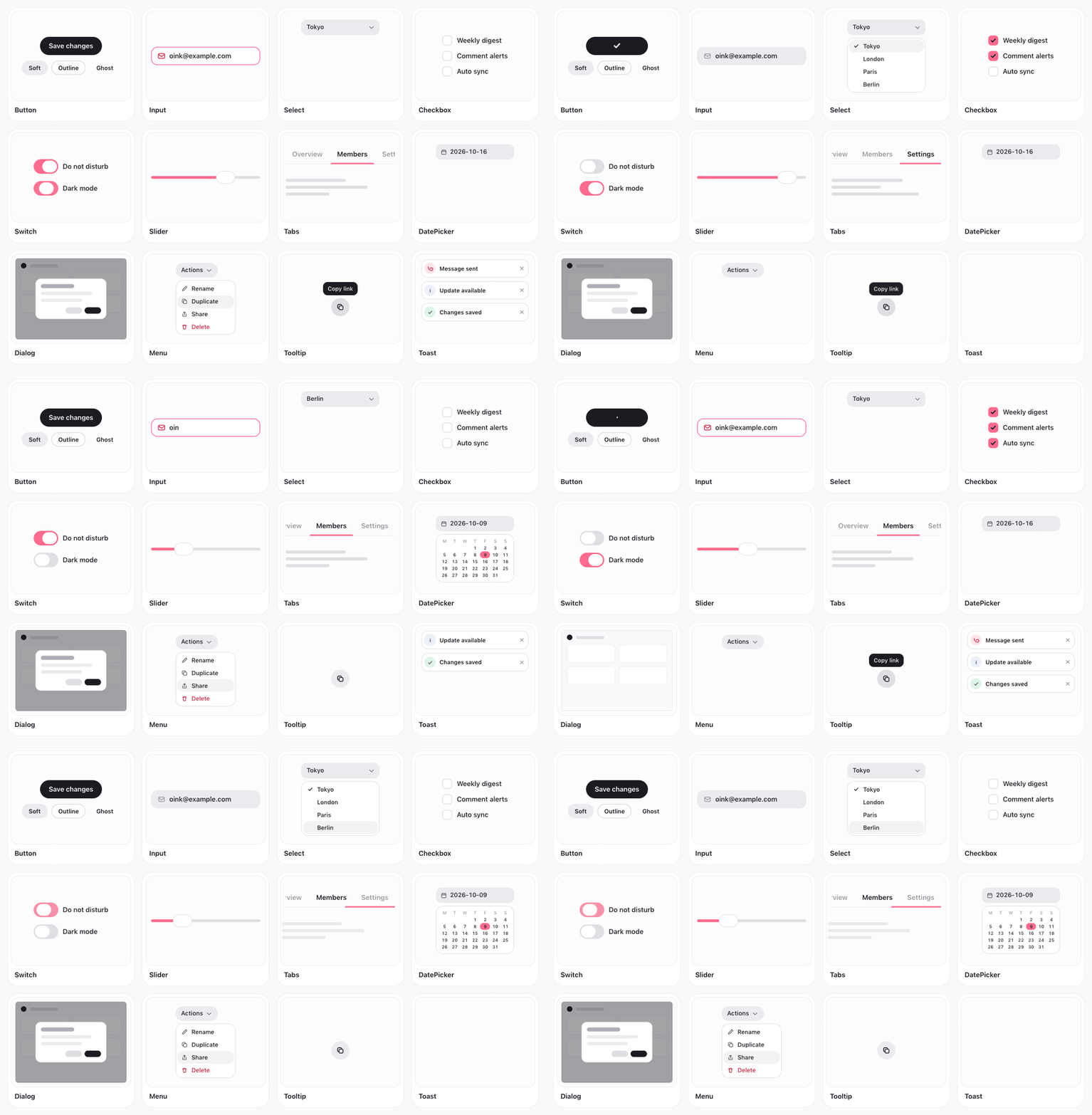
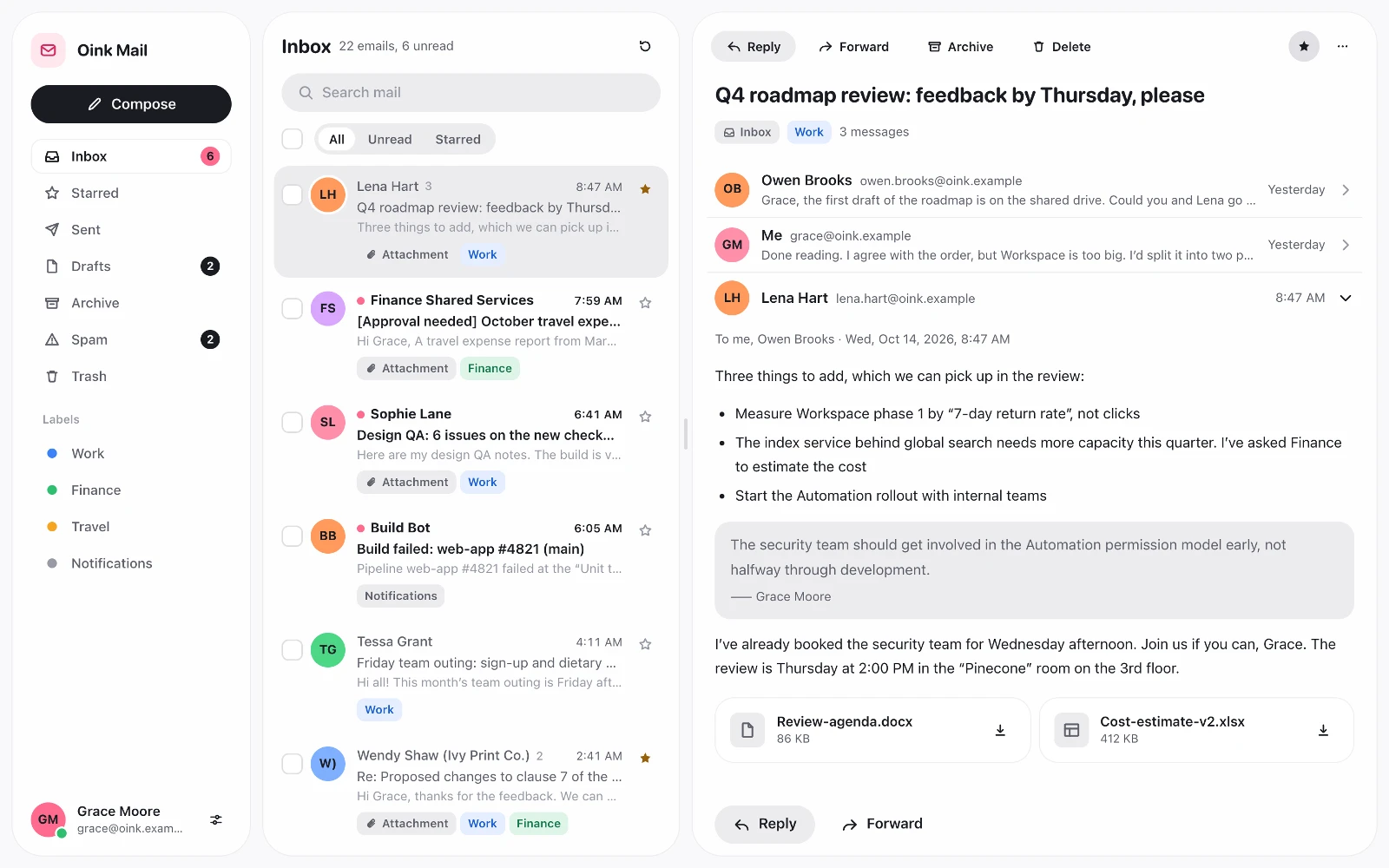
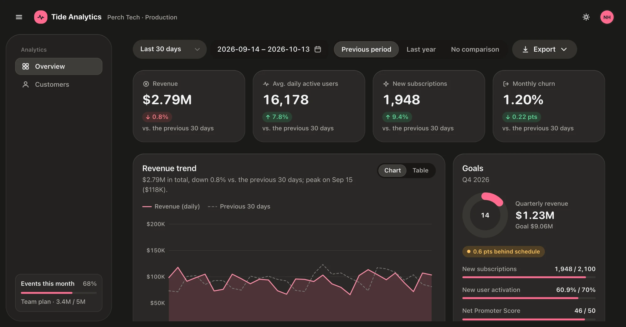
A soft, flat, quiet React component library: large continuous corner radii, flat surfaces with hairlines instead of shadows, an ink-and-neutral palette with one accent color, and quick, purposeful motion. Responsive and accessible out of the box, with light and dark themes.
Docs and live examples: https://oink-ui.hachiwii.com

npm install oink-uiReact 18 or newer is a peer dependency.
Import the styles once in your entry file, then wrap your app in OinkProvider:
import 'oink-ui/styles.css';
import { Button, OinkProvider, Toaster } from 'oink-ui';

export function App() {
  return (
    <OinkProvider>
      <Button variant="primary">Get started</Button>
      <Toaster />
    </OinkProvider>
  );
}
oink-ui/styles.css contains every design token (--ok-*) and every component's styles. To ship only what you use, import oink-ui/styles/base.css first and then one entry per component family, e.g. oink-ui/styles/button.css, oink-ui/styles/dialog.css. The comment at the top of each entry lists the other entries it depends on.
Button, Input (including affixes), Select, Segmented and Menu use regular (400) text, including selected menu options. Selection is shown by the existing fill or checkmark. SearchInput retains its 500 navigation text; Kbd also uses 500. Sizes and variants keep their existing meanings: size="sm" remains an explicit compact choice (32px desktop height), while the default md remains 40px and lg remains 48px. Small ColorSwatches remain 22px; menus and tooltips keep their existing geometry.
Switch defaults to a 44×26px track, a 26×20px thumb and 12px checked travel. size="lg" retains the previous 54×32px track (32×26px thumb, 16px travel); size="sm" uses 36×22px (20×16px thumb, 10px travel). All sizes keep the 3px inset, stretched thumb when pressed, native checkbox, focus ring and disabled states.
Row labels use 14px/1.3 at 400; descriptions use 12.5px/1.4 at 300. The 56px minimum height, 12px vertical padding, 20px horizontal inset and Group surfaces are unchanged. By default, controls keep their natural width while labels wrap; controlWidth="fill", a fixed width and stack="auto" still opt into flexible layouts. Segmented keeps its natural width unless block is set.
Accordion headings use the same 56px minimum height, padding and text as Row. A plain Accordion directly inside Group inherits the group's inset, shares dividers with adjacent rows and removes its own content padding so nested rows align. A plain Accordion in an already padded Card still has no horizontal inset. Use variant="plain" for these embedded panels to avoid a second Group surface.
The browser regression check covers switch sizes and pressed geometry, regular text, selected options, Group-embedded Accordion alignment and Row's natural / fill / fixed / wrapping layouts in light and dark. It uses an existing Playwright installation and writes evidence outside the repository:
node scripts/check-control-defaults.mjs /path/to/playwright/index.mjs /absolute/evidence/directoryOinkProvider sets the theme, accent color, motion preference and the language of built-in strings:
| Prop | Values | Default |
|---|---|---|
defaultTheme |
'light' | 'dark' | 'system' |
'system' |
defaultAccent |
'pink' | 'orange' | 'amber' | 'blue' | 'violet' or any #rrggbb |
'pink' |
defaultMotion |
'auto' | 'full' | 'reduced' |
'auto' |
locale |
'auto' | 'zh-CN' | 'en-US' — 'auto' follows the browser language: Chinese → zh-CN, anything else → en-US |
'auto' |
storageKey |
remember the user's choices in localStorage under this key |
— |
cornerFallback |
draw the superellipse corners with script in engines without corner-shape (see Corners) |
true |
With a custom accent color, the text color on top of it (ink or white) and the darker / lighter variants used for text are derived automatically. useOink() reads and changes the theme at runtime.
Components render the same markup on the server and the client, so they work with server rendering and static prerendering. The server can't know the visitor's language, so with locale="auto" the server render and the hydration pass use en-US and switch to the browser's language right after; if you render on the server, pass locale explicitly (for example from the URL or the Accept-Language header).
Containers use continuous-curvature superellipse corners: border-radius plus corner-shape: superellipse(1.75) (the --ok-corner token), with radii multiplied by --ok-rk (1.45) so they look as large as their nominal size. Fully round shapes (pills, circles) stay corner-shape: round.
When overriding a component's shape in application CSS, override its fallback marker in the same rule, including explicit round or inherited shapes:
.search-button {
  border-radius: calc(14px * var(--ok-rk));
  corner-shape: var(--ok-corner); --ok-shape: var(--ok-corner);
}
WebKit drops corner-shape, so omitting --ok-shape can retain a component's original marker (for example Button's round) even though its radius changed. A radius near half the control height then becomes a pill. The fallback does not infer the intended shape from radius alone.
Only Chromium supports corner-shape (Chrome, Edge, WebView2). In Safari and in the WKWebView that Tauri uses on macOS, OinkProvider turns on a small script fallback that draws the same curve Chromium draws, so a Mac build looks like the Windows build. The fallback also starts in Firefox, which lacks corner-shape too, but it has not been checked there yet:
- It does nothing at all where
corner-shapeis supported, and nothing on the server. - It finds the elements to redraw through
--ok-shape, a non-inherited custom property every stylesheet declaration ofcorner-shapeis paired with. Fully round elements keep the nativeborder-radius. - On those elements the native corners are squared off and then cut along the curve with
clip-path; the parts native painting can't put on a curve — the hairline, the top highlight, borders and the focus ring — are patched in with a nine-sliceborder-image. WebKit uses a persistent named CSS canvas, drawn synchronously from the same SVG paths and the native transition's computed colours. Colour changes neither replace an image resource nor start a separate image-animation clock. Other fallback engines retain SVG images. Fills, straight edges and hover / press transitions stay native. Clipped content (images, scrolling areas) is cut on the curve too. - Dashed, dotted, double and other non-solid outlines (including
auto) keep native rendering for the whole element or pseudo-element; a same-size host behind such a pseudo-element also stays native. This preserves the browser's dash spacing and avoids duplicate solid arcs or clipped dashes. These parts use ordinary round corners in fallback engines, even with--ok-shape: var(--ok-corner), and automatically return to superellipse rendering when their outline becomes solid or disappears. A transparent non-solid outline follows the same rule. - Interaction changes are committed in a microtask before painting; attribute changes from application event handlers are also flushed by the mutation observer before painting. Transition and animation events update the patch synchronously. WebKit redraws the same canvas during colour and geometry transitions; other fallback engines prepaint fixed colour endpoints. Corners with either radius axis at zero keep native shadow geometry, without the curved patches' 1px antialiasing extension.
- It follows mounts, unmounts, resizes, pixel-density changes, theme changes, hover, focus and running transitions. The canvas backing follows device pixel ratio and is released when the part is removed. Native
corner-shapeengines do not create canvases or observers.
Applications upgrading from 1.0.5 can remove the forced --ok-shape: round workaround on dashed outlines and use the usual paired shape declarations. Selection rings can use box-shadow again, including stacked gap/accent rings and tiles with square contact corners; a separate SVG selection ring is not required.
Without OinkProvider, call installCornerFallback() once on the client (it returns a function that removes it again; calls are reference-counted). <OinkProvider cornerFallback={false}> turns it off. Your own CSS gets the same treatment when it pairs the declarations: corner-shape: var(--ok-corner); --ok-shape: var(--ok-corner);.
Code that reads the tokens to draw matching shapes (getComputedStyle(document.documentElement).getPropertyValue('--ok-corner')) sees superellipse(1.75) and --ok-rk: 1.45 wherever the corners are superellipses: natively in Chromium, and in other engines once the fallback is running (it marks <html data-ok-corner-fallback>). Before the script runs, or with the fallback turned off, those engines draw plain round corners and the tokens say round and 1. cornerShapePath() returns the SVG path of a box with these corners, using the same Bézier construction as Chromium.
Text controls cancel an IME-confirmation Enter before caller key handlers or implicit form submission. Both isComposing and WebKit's trailing keyCode === 229 are recognised, including when compositionend precedes the keydown. A subsequent ordinary Enter keeps its usual behaviour. This boundary also covers SearchInput, date/colour text editors, NumberInput, Combobox and PIN cells; Form protects raw inputs, and explicit Enter actions ignore the same confirmation key.
Field waits until composition ends before starting its error shake. WKWebView briefly deletes the marked text before inserting the committed text, so live validation can report a temporary empty value even when no form is submitted. Input changes are preserved; a genuinely invalid committed value still shakes, and ordinary editing keeps immediate feedback. This behaviour was verified with macOS 26.6.2 Pinyin in WKWebView.
npm install
npm test           # vitest
npm run typecheck
npm run build      # dist/: ESM + CJS, type declarations, styles.css and per-component style entries
Every push to main that changes code is released automatically as a new patch version (1.0.x) by release.yml; put [skip ci] in the commit message to skip a release.
MIT © Hachiwii