
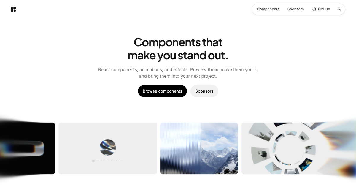
Creative React components. New drops every week.
WebGL materials, physics, glass refraction and motion — ready to install with the shadcn CLI,
customizable from the browser, and yours to edit once they land in your project.


- Built to stand out. Glass, light, physics and motion effects that you won't find in a typical UI kit.
- Customize before you install. Every component has a live preview and visual controls on reactdrops.dev. The usage snippet updates as you tweak it.
- Source in your project, not a black box. The shadcn CLI copies plain
.tsxand.cssfiles into your codebase. Read them, change them, own them. - Minimal dependencies. Most drops need nothing beyond React. Only the orb and the pointer use GSAP.
- Typed and accessible. Written in TypeScript, and they respect
prefers-reduced-motion.
Add any component to a React project with the shadcn CLI:
npx shadcn@latest add https://reactdrops.dev/r/refracted-text.jsonThen use it:
import { RefractedText } from './components/refracted-text';

export function Hero() {
  return <RefractedText text="PRO" />;
}
Tip
Use reactdrops.dev (not .com) for registry URLs, bookmarks and sign-in. reactdrops.com is a secondary domain that redirects to it.
| Component | Category | Description | Dependencies |
|---|---|---|---|
| Bubble UI | Button | Soap-film buttons, menus, search, switches and sliders with configurable glass and oil. | html-to-image |
| Liquid Glass Orb | AI | A liquid glass orb for AI interfaces with agent states, voice response and six palettes. | gsap |
| Refracted Text | Text Effect | Glass letters with a character lift, a refracted light beam and spectral colors. | — |
| Liquid Glass Logo | Text Reveal | A droplet becomes a glass tile that refracts your logo, then clears to the original. | — |
| Chromatic Button | Button | A native button with a living WebGL chromatic material and spherical reflections. | — |
| Showcase Pointer | Cursor | Named, colored cursors that hover, press, drag and type over your UI, without triggering real clicks. | gsap, @gsap/react |
| Fan Gallery | Gallery | Image cards on a symmetric curve, with spring physics and hover lift. | — |
| Fractal Glass | Image | Striped glass refraction with blur, levels, noise and PNG export. | — |
| Topographic Terrain | Background | Animated 3D topographic layers with adjustable camera, material and lighting. | — |
| Topographic Flow | Background | Evolving contour lines with elevation gradients and five pointer effects. | — |
| Shape Physics | Background | 3D characters that fall, pile up, follow the cursor and can be thrown. | — |
Install all components
npx shadcn@latest add https://reactdrops.dev/r/soap-bubble.json
npx shadcn@latest add https://reactdrops.dev/r/liquid-glass-orb.json
npx shadcn@latest add https://reactdrops.dev/r/refracted-text.json
npx shadcn@latest add https://reactdrops.dev/r/liquid-glass-logo.json
npx shadcn@latest add https://reactdrops.dev/r/chromatic-button.json
npx shadcn@latest add https://reactdrops.dev/r/showcase-pointer.json
npx shadcn@latest add https://reactdrops.dev/r/fan-gallery.json
npx shadcn@latest add https://reactdrops.dev/r/fractal-glass.json
npx shadcn@latest add https://reactdrops.dev/r/topographic-terrain.json
npx shadcn@latest add https://reactdrops.dev/r/topographic-flow.json
npx shadcn@latest add https://reactdrops.dev/r/shape-physics.json
Bubble UI follows the catalog defaults: Light glass on light pages and Rainbow glass on dark pages. An explicitly selected material or color preset and custom Oil settings take precedence, including Oil film set to 0. See the Bubble UI guide.
Each example assumes you installed the component with the command shown. Visit the component page for every prop and a live customizer.
Liquid Glass Orb: AI agent states and voice
npx shadcn@latest add https://reactdrops.dev/r/liquid-glass-orb.jsonimport { LiquidGlassOrb } from './components/liquid-glass-orb';
export function Example() {
return <LiquidGlassOrb state="idle" />;
}- States:
idle,listening,speaking,thinking,searching,successanderror. - Pass
audioLevelorgetAudioLevelto supply a normalized voice level between 0 and 1. - The default palette is Monochrome, with grain set to
0.3. - The orb grows from the center on its first frame (
power4.out). SetanimateEntrance={false}to disable this; reduced motion also skips it. - Installs
liquid-glass-orb.tsx,liquid-glass-orb.cssand GSAP.
Refracted Text: glass lettering with a light beam
npx shadcn@latest add https://reactdrops.dev/r/refracted-text.jsonimport { RefractedText } from './components/refracted-text';
export function Example() {
return <RefractedText text="PRO" />;
}- Customize the material and spectrum with
topColor,bottomColor,dispersionandcolorIntensity. - The default PRO uses a square O, 2.25% extra bold, 80% height and 1% corner rounding. Typography controls are independent.
- Installs four files, including the original and square-O fonts and their SIL Open Font License.
- Requires WebGL 2. No runtime library beyond React.
Liquid Glass Logo: a droplet that reveals your logo
npx shadcn@latest add https://reactdrops.dev/r/liquid-glass-logo.jsonimport { LiquidGlassLogo } from './components/liquid-glass-logo';
export function Example() {
return <LiquidGlassLogo logo="/logo.svg" ending="logo" style={{ height: 480 }} />;
}- Supports light and dark themes, custom SVG/PNG logos and background images.
- The catalog demo adds logo and background uploads, glass controls, aspect ratio and resolution choices, and MP4/WebM export at 60 FPS by default. The available video formats depend on the browser.
- Installs four source/style files. No runtime library beyond React.
Chromatic Button: a WebGL material on a native button
npx shadcn@latest add https://reactdrops.dev/r/chromatic-button.jsonimport { ChromaticButton } from './components/chromatic-button';
export function Example() {
return <ChromaticButton onClick={() => console.log('clicked')}>Get started</ChromaticButton>;
}- A procedural color field projected onto a sphere, with fixed, two-color, three-color or full-spectrum palettes, hover effects and an entrance.
- Installs five source/style files. No runtime library beyond React.
Showcase Pointer: scripted multiplayer cursors
npx shadcn@latest add https://reactdrops.dev/r/showcase-pointer.json- Animates named, colored cursors over an interface. Labels fade and scale by default.
- Scripted presses call
onCursorPressfor local UI responses, without dispatching real clicks, submitting forms or following links. - Installs four source/style files and GSAP.
Fan Gallery: spring-physics image fan
npx shadcn@latest add https://reactdrops.dev/r/fan-gallery.jsonimport { FanGallery } from './components/fan-gallery';
export function Example() {
return (
<FanGallery
items={[
{ src: '/images/one.webp', alt: 'First project' },
{ src: '/images/two.webp', alt: 'Second project', href: '/work/two' },
{ src: '/images/three.webp', alt: 'Third project' },
]}
/>
);
}- Cards arrive with spring physics. Hovering or focusing a card lifts it while the fan parts around it.
- Installs six source/style files. No runtime library beyond React.
- Inside this repository the same component is available as
@reactdrops/components/fan-gallery.
Fractal Glass: striped glass over any image
npx shadcn@latest add https://reactdrops.dev/r/fractal-glass.jsonimport { useRef } from 'react';
import { FractalGlass, type FractalGlassHandle } from './components/fractal-glass';
export function Example() {
const glass = useRef<FractalGlassHandle>(null);
// Call await glass.current?.exportImage() to obtain a PNG Blob of the current frame.
return <FractalGlass ref={glass} src="/your-image.jpg" alt="Your image" height={480} />;
}- Blur, levels, optical rendering and hover/touch presets.
- The catalog supports custom image uploads, a live miniature while editing, and PNG export.
Topographic Terrain: 3D contour layers
npx shadcn@latest add https://reactdrops.dev/r/topographic-terrain.jsonimport { TopographicTerrain } from './components/topographic-terrain';
export function Example() {
return <TopographicTerrain height={540} />;
}- Adjustable camera, material and lighting.
- Installs nine source/style files. No runtime library beyond React.
Topographic Flow: living survey lines
npx shadcn@latest add https://reactdrops.dev/r/topographic-flow.jsonimport { TopographicFlow } from './components/topographic-flow';
export function Example() {
return <TopographicFlow preset="survey" height="100svh" />;
}- Contour lines over a slowly morphing elevation field, with optional elevation gradients and grain.
- The pointer reshapes the contours with
hoverEffect:rings(default),spread,swirl,rippleordrag. - Installs seven source/style files. No runtime library beyond React.
Shape Physics: playful 3D characters
npx shadcn@latest add https://reactdrops.dev/r/shape-physics.jsonThe canvas fills its parent, so give it a height:
import { ShapePhysics } from './components/shape-physics';

export function Example() {
  return <ShapePhysics height="100svh" />;
}- Spheres, cones, cubes, clouds, drops and flowers fall in, pile up, follow the cursor and can be dragged and thrown.
- Use
depth="2d"to keep the figures flat. A ref exposesreplay(),clear(),addShape()andshake(). - Installs six source/style files. No runtime library beyond React.
Requires Node 22.13–24 and pnpm 11.5.2.
pnpm install --frozen-lockfile
pnpm dev             # catalog at http://localhost:5173/components
pnpm build
pnpm typecheck
pnpm test
pnpm check:public
pnpm check:packages
Run pnpm registry:build to regenerate the installable registry files from the component source.
Repository layout
apps/catalog/            Catalog app with previews and customizers
packages/components/     Component source (the source of truth)
packages/catalog-data/   Component metadata, prop schemas and generated source
packages/catalog-ui/     Catalog pages and customizer UI
packages/component-schema/  Shared prop schema types
scripts/                 Registry generation and release checks
public-files.json lists the reviewed files. The publication check audits working files, staged content and reachable Git history. Run pnpm release:guard in a Git clone to install local pre-commit and pre-push checks.
If ReactDrops helps you ship something that stands out, give it a star. It helps other developers find it and keeps the weekly drops coming.
ReactDrops source code is available under the ReactDrops Component License 1.0. It permits personal and commercial websites, apps, services, and client projects. It does not permit redistributing the components as a library, UI kit, reusable template, starter, registry, or code bundle, whether free or paid, without separate written permission. Modifications remain subject to these conditions. No visible credit is required in your product's interface.
This is source-available software under a custom license, not an OSI-approved open-source license. Third-party dependencies and separately identified code retain their own licenses and required notices. The registry embeds the full ReactDrops license in each installed source/style file.
The catalog's Fan Gallery demo uses photographs by Mavis Hopper and Julien Moreau
from Unsplash (apps/catalog/public-release/assets/orbit-tunnel/) and ReactDrops
artwork (apps/catalog/public-release/assets/hero-artwork/). These images are
demo content and are not covered by the ReactDrops software license; replace them with your own
images when you use the component.